
The technology is evolving, 30 years ago the only communication mean we had was landline phone, then comes the Pager, then Mobile Phone and now the Smart Phones. The same goes for other technologies and it has also evolved the way online business works. In short your business has to be smart enough to cater the needs of your customers more effectively and it all starts with a responsive website design.
Gone are the days of traditional website and If your website is not optimized for mobile viewing then you might be at stake of losing substantial business. Don’t believe me? Keep reading…!
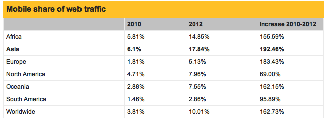
Statistics conducted at the end of 2012 shows huge increase in website traffic on mobile devices where Asia leads the group by a significant increase of over 192% (I know China plays the major part in it, but still it is not the only country in the region).
Another report says that Google earns more than 2.5 Billion in mobile ad revenue annually. This figure is something that sparks the *dimagh ki batti*(translation: enlighten your mind) to think about going mobile with your online business/presence.
If you think that every website can be opened in smartphones properly, then you’re “RIGHT” but wrong at the same time. Because opening on mobile device is One thing and changing the way it looks on mobile device is what matters the most.
Look, what happens when you open a ‘non mobile friendly’ website on your mobile phone, you have to ZOOM-IN to read what is written on the website, then move the screen from here to there to read the whole line of the paragraph (like the old typewriter), when you move to the next page, you have to again zoom-in to read. And if it’s a Shopping Site, and the user has to do it on each and every page of the site then it would be soon enough that user quits your website irritated by the whole experience.
Website design has to function properly on mobile devices. This is where Responsive Website Design comes in to action. It creates two versions of the website, one for the computers and second for mobile devices. It analyzes the device automatically and adjusts itself. Though, it requires clear planning from the scratch.
Advantages of having a mobile friendly website
1) Better user experience
It improves the visibility of the content and adjusts the graphics and text according to the best possible size for reading and navigation in the website.
2) Faster loading
It uses fewer graphic and more CSS styling which means it requires less data to download and your website loads up quickly.
3) More revenue
If it’s a shopping site, then it will help attract more users for better and easy shopping through mobile. So, users can shop anytime, anywhere.
Recent Comments